My experience with the new Outlook client (for Windows)

Today, I realized I’m old enough to have experienced Outlook, Microsoft Mail before that, Unix-email clients such as elm and pine, Usenet and NNTP (“news”), and probably a system or standard before these. Outlook is so deeply ingrained into my daily patterns that I’ve ceased thinking about it. It’s an app for doing business, primarily for me.
I love it and the many quirks and annoyances I’ve learned to tolerate. There are too many issues to list here. Still, I’m sharing everyone’s opinions when I say that if you accidentally click on the top checkbox in the calendar view for All Calendars, it takes a minute or two for Outlook to recover from this horrible mishap.
I was delighted when Microsoft announced they were finally doing something about Outlook. If you recall, there was an issue back in the day with Visual SourceSafe or some such product, and the rumor – at the time – was that someone perhaps misplaced the source code for the product. I’ve felt the same with Outlook. With all the effort, energy, and love Microsoft Teams and OneDrive are getting, I was hoping that a bit of effort was given to Outlook. It is, still, possibly the tool that I know everyone uses (beyond those who strayed away from the flock and went to Gmail, for some reason).
There is a lot to like about Outlook, as well. Many times someone has suggested to me – perhaps over a cup of coffee at a conference venue – that I should migrate away from the horrible atrocity that is Win32-based Outlook and go for the modern version: Outlook on the Web (or OWA, for those of us who still yearn for Exchange 5.5)! But I cannot. I’m held prisoner in the embrace of Outlook with its native support for multiple accounts across different tenants. I have 8 identities that I embrace – and as I turned 46 years this year, I’ll hold on to these accounts for an estimated 40 more years.
Overlaying calendars in the beaten-up Outlook is fantastic. With a simple glance, I can see everything happening in my life, with my family, colleagues, and across the companies I’m involved with. It’s amazing.
So, when Microsoft announced the new Outlook app some time ago, I wasn’t a fan. It only supported a limited number of account types and generally felt half-baked. Then, quite recently, the app received several updates and became reasonably OK.
I’ve been using the new Outlook for about a month now on all my Windows devices. It isn’t available for the macOS, so I’m still using the regular Office Outlook client with the MacBook Pro.
The new Outlook is a progressive web app. It installs like an app, but you can sense and feel it’s wrapping Microsoft Edge around the corners. This is both good and bad. The app supports multiple personal and organizational accounts, a must-have capability.
It works well. It feels fresh and modern. Accessing email and viewing calendars – all good here. It’s very close to the old Outlook client in terms of usability. At times, it’s much faster. Other times it’s more sluggish – but in a different way. The app never freezes, like the old Outlook does, at least once daily. It has never crashed for me, either. It has made email more enjoyable for me.
Then there are the limitations of the web app. Typical stuff, like downloading all 57 attachments from an email (that’s still a thing), is next to impossible. You open them one at a time, click Download, wait for the popup, and open the following file. Or, you try clicking Download all, and nothing happens. Only later, I found out that there’s a hidden popup – in a random instance of the new Outlook app – opening asking for your permission to do so. Again, a feature of the constrained web app.
The new Outlook app mostly has critical features in place. Some weird omissions do exist – such as the incapability of opening .ICS files. Adding butwhy.gif here with Ryan Reynolds.
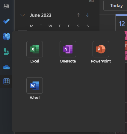
Microsoft does a stellar job of trying to shoehorn all sorts of things to the client that email doesn’t need. I don’t need any of this:

I need nothing from Microsoft Viva, Bookings, OneDrive, or any Microsoft 365 apps. I need an email and a calendar. Sadly, I cannot remove or hide icons from the left navigation bar. I wish these were optional and not forced down on our throats.
Another weird quirk with the app – and I realize it’s still a preview build – is the inability to save most of my settings. I’ve carefully added my favorite folders in the shortcuts. I walk to my other PC because I have 2, and open the new Outlook: it has one of those folders at random. And it resets the other PC’s view then, too. I just gave up on the shortcuts.
None of the classic keyboard shortcuts work any longer. My go-to shortcut has been Ctrl + Shift + I for going directly to my default Inbox, and that does nothing now. I hit that key combo 27 times a day, in vain.
Whenever you want to empty your recycle bin, you might have the muscle memory to right-click > Empty and press Y on the keyboard to confirm the dialog. But the dialog doesn’t support the classic Y/N confirmation we’ve had since maybe 1982. So, back to using the mouse, it is.
Don’t get me wrong. I love the new app incarnation of Outlook. I just wish that much of the old capabilities will not be thrown overboard in anticipation of something more modern. Change is not modern – and change is only sometimes desired for things that seem to work decade after decade.
I’m still on the new app; the old Outlook app feels very beaten up and tired now. I’ll learn to like the missing capabilities, but secretly I hope someone would integrate at least Ctrl + Shift + I back. I can’t be the only one using shortcuts to get around apps.