A few tips for using MacOS, when you have a strong Windows background

It’s been three weeks since I replaced my main laptop with the Apple MacBook Pro 14″ (M2 Max, 2023). You can read my initial thoughts here. As I’m writing this blog on the device, I’m still as happy with the device as the day I got it. Perhaps there’s a little bit of “ooh, shiny” bias here, to be honest.
I’ve since configured some of the nuisances of MacOS to fit my personal preferences better—nothing major, and nothing massive – tiny things.
MacOS stays out of the way
What surprises me is how easily MacOS stays out of the way. I’m only reminded that I’m not on Windows when I open the Settings or built-in terminal apps. Initially, I was wary that Apple would push their software down my throat on every occasion – I don’t use Safari, iCloud, or any of the Office apps Apple has, and nothing from their productivity stack of tools. And would you look at it? Once I’ve removed them from the Dock, they are *nowhere* to be seen! Ever again! I’m a little bit proud that this machine has never run Safari, not once (I downloaded Firefox on another box and copied it directly to my MacBook).
It’s a massive difference from Windows 11. Upon installing a fresh Windows 11, the Start Menu is littered with stuff I don’t want or need – TikTok, Candy Crush, and other third-party apps that are junk to me. Also, Windows persistently defaults to using Microsoft Edge in all instances – such as when I’m too quick typing something in Windows search, Windows gets confused and defaults to opening Edge to Bing to perform a search. Some of these are easily fixed, and others are just massive frustrations.
But obviously, MacOS has its downsides – it’s not all sunshine.
The resolution – why is it so poor?
I used the device for a few weeks, and I was happy. What did bother me was that on my previous ThinkPad X1 Carbon laptop, with the 4K panel, I was used to cranking down the DPI to fit as much as possible on the tiny 14″ screen. With MacOS, and on a similarly sized 14″ display on the MacBook Pro, it felt like I had a quarter of that resolution.
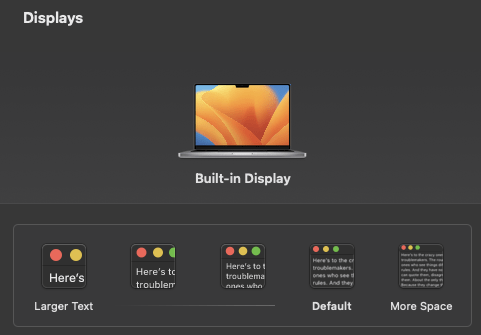
Within the MacOS Settings app, the only setting I could find was this kid-friendly setting:

I selected More Space and admittedly, I did get a tighter fit for all elements within the OS. But somehow, having just one browser tab open, I felt the screen was already “too full.”
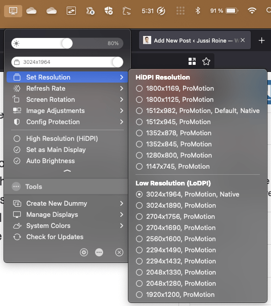
But then my good friend Elio tweeted about a third-party app called BetterDisplay. You can download it here: https://github.com/waydabber/BetterDisplay. It’s a neat little app that allows you to modify many display panel options that are not there by default.
And lo and behold – the default resolution for MacOS is a horrible 1800×1169. No wonder it felt cramped! I cranked up the setting to 3024×1964, and it’s like I got another display now.

The app will cost you about $15, which I promptly paid as I feel it’s worth the small investment.
The awful app-switching experience
By default, switching from one app to another with Cmd-Tab is pure torture. You get a nice list of open apps, but usually, when you hop to another app, the app window doesn’t become visible. It’s “somewhere” there. I fail to grasp the idea of why it works like that. Thankfully, AltTab, a free third-party app, fixes it and brings an “Alt-Tab” experience to MacOS, just like on Windows 10/11. It’s perfect.
This is how the new, improved app-switching experience looks:

It’s vastly better and has plenty of configuration options. I just left it mostly at defaults and forgot it’s even installed. It just works.
The easiness of using virtual desktops
On Windows, I used to embrace virtual desktops back in the day. Somehow, it hasn’t been too smooth with more modern Windows versions. The app windows would travel all over the place, or they would magically reorganize to a different setup now and then. I just gave up eventually.
On MacOS, the virtual desktop experience is tightly integrated into the touchpad. It’s buttery smooth – swiping left or right with three fingers, and in less than a second, I’m on a different desktop. The apps stay put. Everything works like a thought.
I’ve settled with a setup where I have three virtual desktops: the main one for whatever I’m working on right now. Like typing this article, checking Twitter and Linkedin, running my password management tool, a few terminals, etc. The second one has most of my communications apps, like Microsoft Teams, WhatsApp, and Signal, running and carefully positioned nicely. And the last one is an overflow for whatever I want to put aside for now.
Perhaps it’s just the large touchpad that makes the difference. On a regular Windows laptop, the touchpad is usually relatively small. Swiping with three fingers is awkward. On the Mac, it’s natural and doesn’t require a single minute to internalize.
A few words on battery life
I wrote previously that I’m getting around 12 and a half hours of battery life from the box. It’s since settled in a bit more. I use a third-party app to show me the runtime, which varies heavily depending on what I do.
The typical time on battery is now “more than 10 hours.” Firefox takes up the majority of the energy available. Everything else, in comparison, is minuscule. I cannot switch to Safari, which presumably would be easier on the battery, so I’m satisfied with this result. Also, WhatsApp is still emulated on the Apple Silicon and is a battery hog. I switched from using the native WhatsApp app to a tab in Firefox.
Right now, I have 80% of the battery left. I am getting about 3 hours and 30 minutes on battery for some reason. It’s not right, as I know that a few hours from now, I will still have about 3 hours and 15 minutes left. Usually, when I charge the laptop, I check the “time on battery” value from Activity Monitor, and it’s anywhere between 15 to 30 hours. I’ve stopped carrying the charger with me on my daily commutes and travels. It charges immensely fast – up to 50 % of the battery in 30 minutes. I plug it in at home when I’m down to 10% of the battery and leave it there overnight. I’ve also configured the Low Power Mode enabled automatically when I’m running on battery. I’m not entirely sure what the effect of that is.
I did a lengthy Teams call with full video between all participants, which ate into the battery like no tomorrow.
On performance
It was hard to set expectations for the performance of the MacBook Pro. “It’s fast!” I read from reviews. “I can open multiple tabs, and it won’t slow down!” someone else wrote. Well, yeah, on Windows, I typically have 30-50 tabs open across multiple displays, and I’m not expecting the machine to slow down. It’s not like the tabs do anything of use. They’re mostly idling until I get to them.
Herein is the dilemma. When I researched and read everything there was on the new Apple Silicon devices, the “performance” bit is mostly always explained along the lines of “you can run 8K video feeds in your Adobe software, and it’s fast!”. But I don’t run any Adobe software. My work does not involve a single moment of shaving off corners from pixels or creating videos or images. I write, communicate, and create through code or low-code/no-code platforms.
Hence, it was hard to quantify what performance I was getting from the device. Is it fast? Yes. Does it slow down, ever? No.
The fans have never kicked in, not once. Or if they have, I don’t hear them. I’m typing on my dining room table, and the wine cabinet is quietly humming in the kitchen. I cannot hear the laptop. Yet, at the same time, the most taxing workload on this machine is a bunch of Firefox tabs open, a few terminals, and Microsoft Teams, and that’s mostly it.
The laptop resumes before I have time to open the lid entirely. Every app breezes along without a single pause – ever. And that’s it.
The Mac vs. Windows debate
Since getting the MacBook Pro, I’ve read about what apps and utilities people recommend. Most articles around this topic assume that anyone getting a Mac is using it to create audio or video. I create audio for our podcast, Ctrl+Alt+Azure, but I use a separate PC with a fixed audio setup.
The assumption seems to be that once you get a Mac device, you will never use a Windows device. But that’s like saying I will use oat milk with coffee, but I’ll never have cow milk again. That’s not how it goes. I can have both if I choose to.
I split my time at home between the Mac device and Windows devices equally. Most days, when I work with others, I trudge to the home office and sit in front of a PC. The webcam and microphone setup is there, and I get to work. Then on other days, I create content alone, like writing a spec or drafting a white paper, and I might choose to use the Mac and sit on the terrace or the sofa.
Everything I touch regarding files and data is synced between all my devices, so I can effortlessly resume work on any box with a display at home.
For me, the Mac vs. Windows debate is fruitless. I don’t have to abandon one for the other. I can choose to get the best of both worlds.
File management on MacOS is 💩
It’s hard to describe how horrible an experience Finder is, the File Explorer equivalent in MacOS. It’s somehow a combination of unintuitive use and poor performance simultaneously. Within Windows 11, the team at Microsoft has done such a stellar job that I find joy in working with files there. On MacOS, it feels like I’m back to a 1995-style approach. The quirks and irks are too many to list, but just a few, perhaps:
How do you open file management with a shortcut key? Well, you don’t! On Windows, you use <WinKey> + E, and that’s it. On MacOS, I just Cmd-Space, type Fin, and press enter. It’s semi-fast.
Once I have the file management open, the fun begins. Let me pick that one file I know I have in a subfolder in OneDrive for Business. Finder opens and puts you randomly into a folder you’ve perhaps visited last. On the keyboard, no way to navigate quickly to the navigation tree. Arrow keys bounce around the files in the current directory. So I use the touchpad to click on OneDrive for Business.
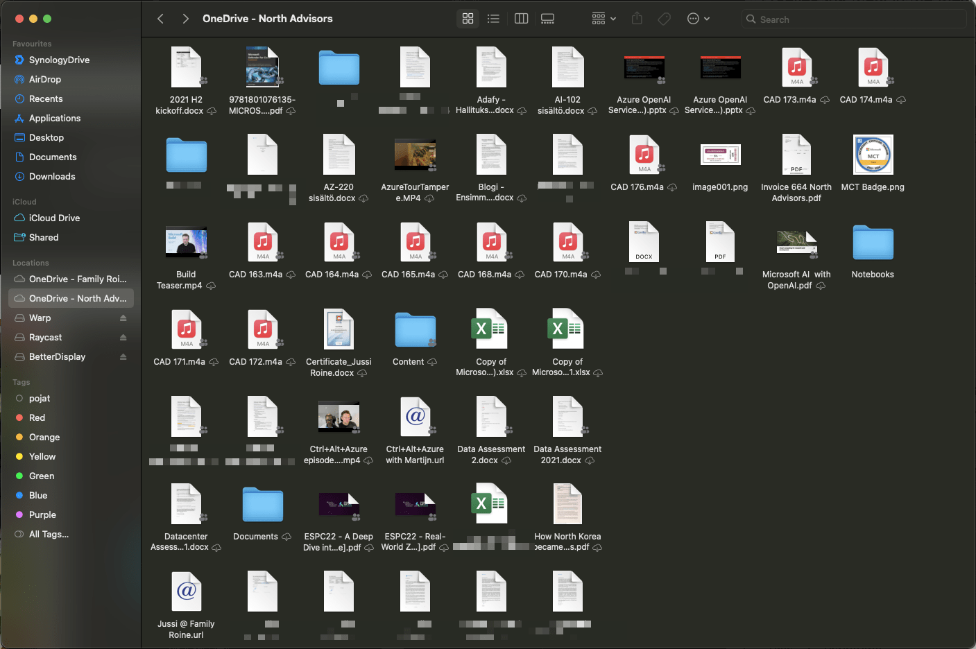
And this is how it looks:

What’s happening here? Nobody knows. The icons are all over the place. I try to use the arrow keys to select a folder quickly, but my focus is now on the navigation tree. Let’s use the touchpad again. I then rapidly arrow-key my way down to a folder and press Enter. Nothing happens. Oh, wait, Finder thinks I want to rename the folder if I press Enter a single time. This makes zero sense.
For the atrocity that is Finder, I never open it and either manipulate my files via a terminal (shell) or find the file directly. Such a shame – it feels like Finder hasn’t gotten any love from the UX team at Apple.
Any regrets? At all?
I realize the Max, in M2 Max, is too overkill for me. I don’t need an actual GPU at all in my life. I’m not playing anything on any device for the foreseeable future. I don’t do 3D design, CAD drawings, or cut-and-chop 4K or 8K videos. I need 2D for apps that I run. So, if I could go back about a month, I would perhaps tell my younger self that I could wait for the “non-M2 Max” model to become available.
The 14″ model seems perfect. I carry the laptop everywhere I go. It’s so lightweight (at 1.63 kg) that I sometimes check if I even brought it along, as I have my backpack with me. Perhaps the 16″ is in the horizon for the distant future. Yet, I’m confident the 14″ will never be too much of a brick to carry with me.
I opted for 32 GB of RAM, so I had to opt for the M2 Max model for availability. Do I need the 32 GB? Not yet. At most, I’ve utilized 15 GB of RAM, and MacOS kindly tells me about 8 GB of that is cached. It’s still lovely to future-proof the device, and I hope to get many years out of it.
In closing
The device is a reasonably traditional laptop with a seamless user experience. It perhaps hasn’t made me massively more productive. But I’m finding more delight in regular work days now, and I have one major worry less – will the battery last me through the coffee cup in the café? Yes, it will. And for that, no money is too much to pay.